Timing Insights & Heatmap
Three charts that answer the same question — "when should I post?" — at different levels of detail: best day of week, best time of day, and a day-by-hour heatmap.
How it works
All three charts use your own post history, filtered by whatever date range and metric you've selected in the dashboard. Times are based on when you posted, measured in your browser's timezone.
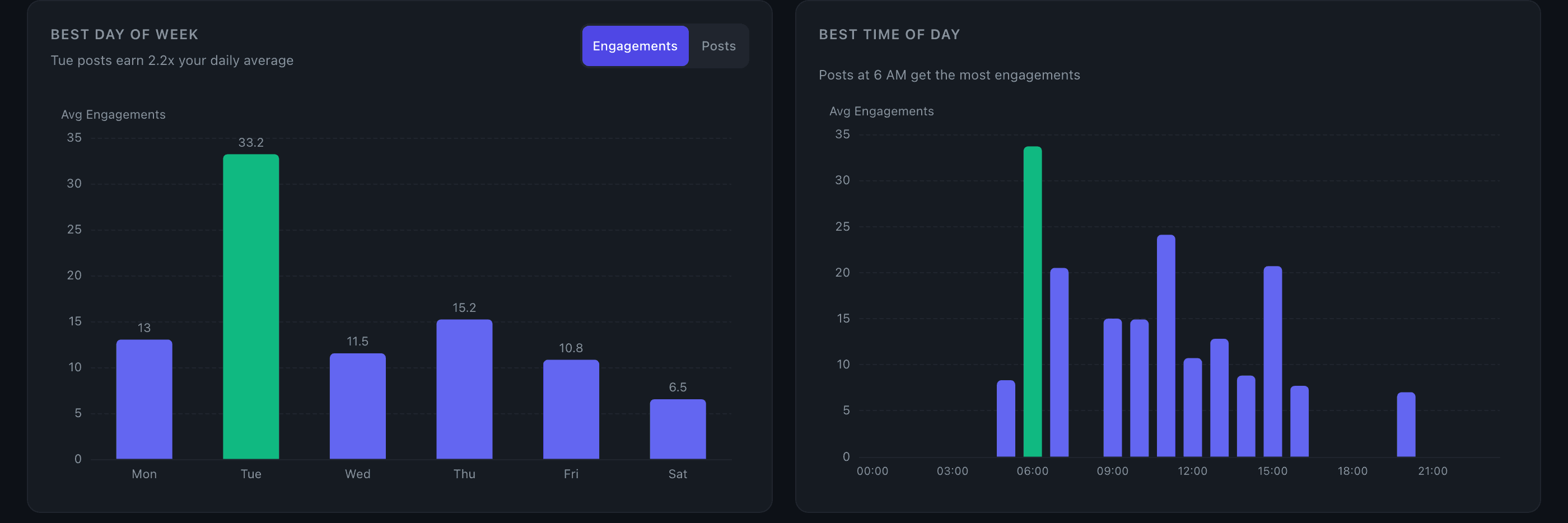
Best day of week shows average engagement (or post count) for each day, Monday through Sunday. The highest bar is highlighted in green and an insight below the chart tells you the multiplier — e.g., "Tuesday posts earn 1.8x your daily average." Toggle between metric and post count to see both your performance and your posting habits side by side.
Best time of day shows engagement by hour across the full 24-hour clock. Every hour is shown (zero-filled where you have no posts), so gaps are visible. The best hour is highlighted.
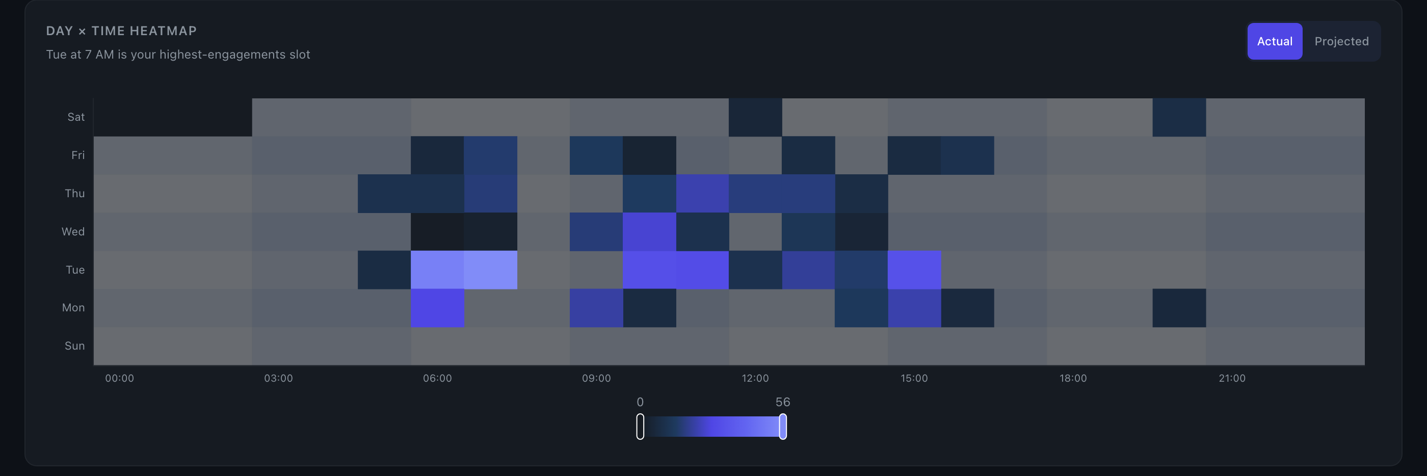
Day × hour heatmap combines both dimensions into a color-coded grid. Darker cells = higher engagement. A toggle at the top of the heatmap switches between two modes:
- Actual — shows only the slots where you've actually posted. Requires at least 3 cells with a positive metric value; otherwise a message prompts you to post more or widen the date range.
- Projected — fills and smooths the entire 7×24 grid using a model that infers likely performance for slots you haven't tested. Requires at least 30 posts in the selected range. Carries an "estimated, not measured" label, and the insight for an untested best slot is phrased as a suggestion ("could be a strong untested slot") rather than a confirmed result.
Key details
- Click to filter — clicking any bar or heatmap cell filters the Top Posts table to show only posts from that day, hour, or day+hour combination. A chip appears in the Top Posts search box. Click the same cell again to clear the filter.
- Low-confidence labels — bars with very few posts are labeled to flag thin data (e.g., "only 3 posts — not enough data").
- Winsorization in Projected mode — per-post values are capped at the 98th percentile before the model runs, so a single viral post doesn't distort the projected grid or stretch the color scale.
- Insights — each chart generates a plain-language insight shown below it. The day-of-week insight shows a multiplier vs. your overall average. The heatmap insight names the best slot, or suggests it if you've never posted there.
Tips
- Switch the day-of-week chart to Posts mode to see whether your best-performing day is also where you're concentrating your effort — or if there's an underposted day worth testing.
- In Projected mode, look for dark cells in rows or columns you rarely post in. Those are the model's best guesses for untested slots based on your overall posting rhythm.
- The time-of-day chart shows the hour you published, not when your audience was most active. If you schedule posts in advance, the published time is what counts.