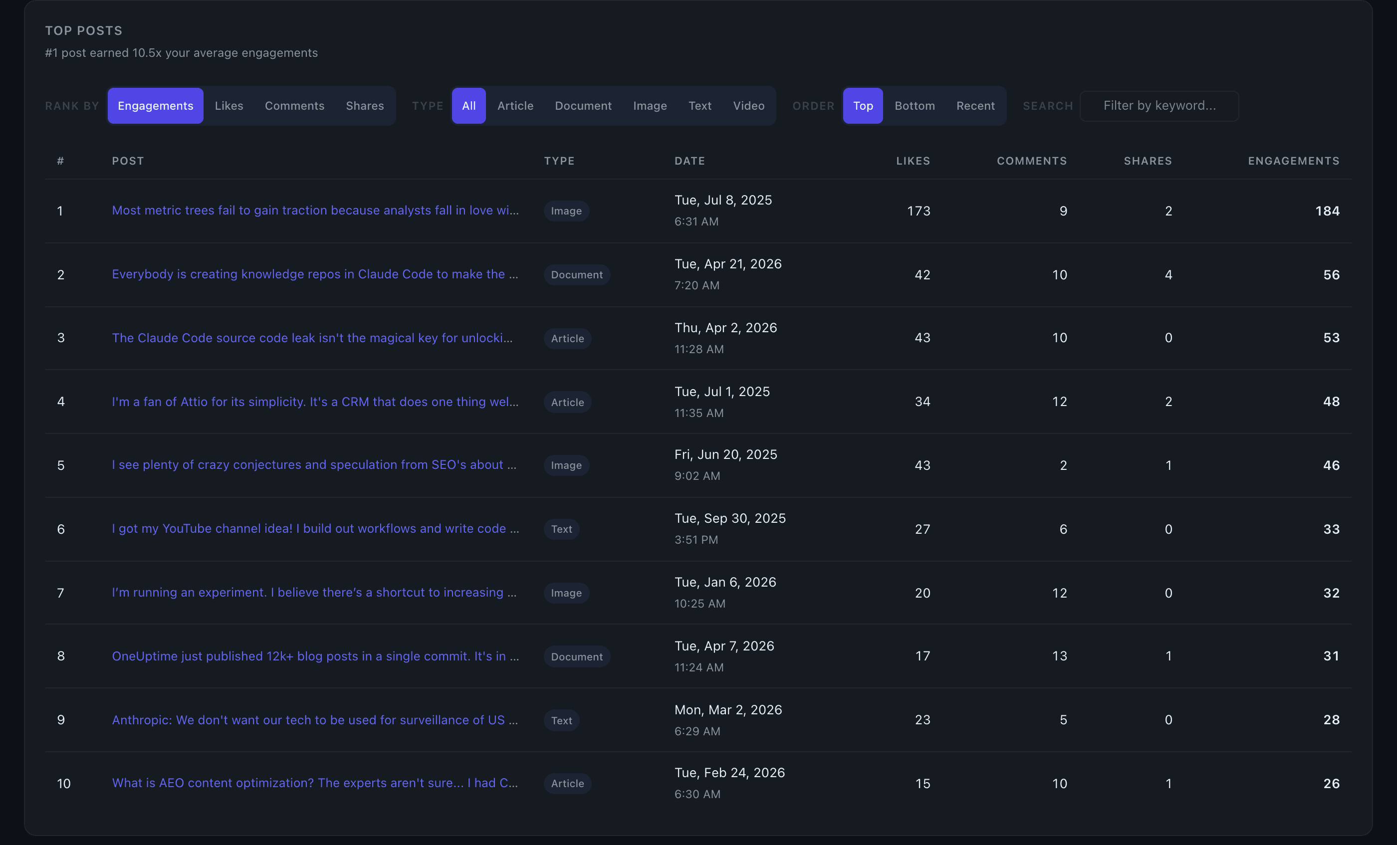
Top Posts
The Top Posts table shows your 10 highest-performing posts ranked by engagement, with direct links back to each original LinkedIn post.
What you see
Each row shows a truncated preview of the post (first ~100 characters, preserving the opening hook), its publish date, and individual counts for likes, comments, and shares. Click any preview link to open the full post on LinkedIn.
The active sort metric is highlighted in the table header. A summary insight above the table (e.g. "#1 post earned 3.2x your average engagements") gives you instant context without reading every row.
Controls
Sort by — three lenses on "best":
- Total Engagement (default) — likes + comments + shares combined
- Comments — surfaces posts that drove the most conversation; useful for identifying lead-generating content
- Shares — surfaces posts that spread beyond your first-degree network
Post type filter — pills let you narrow to a specific format (text, image, video, document, article, poll). Only post types present in your data appear as options.
Order — toggle between Top (descending), Bottom (ascending), or Recent (newest first).
Cross-chart filtering
Other dashboard charts act as filters on Top Posts. Click a bar or cell in any of these charts and the table updates to show only matching posts, with a filter badge showing the active context and result count:
- Day of Week — posts from a specific day
- Time of Day — posts from a specific hour
- Content Type — posts of a given format
- Hashtag Performance — posts that used a specific hashtag
- Link Domains — posts linking to a specific domain
Click the filter badge's dismiss button (or click the same chart element again) to clear the filter. Chart filters and the text search are mutually exclusive — activating one clears the other.
Score and delta columns (Edge)
On the Edge plan, two additional columns appear: Score (1–5 stars, your predicted performance tier for that post) and vs Expected (how the post actually performed relative to the model's prediction). Click any row to expand a breakdown showing predicted vs actual percentile, engagement ranges, and the specific factors that helped or hurt performance.
Tips
- Sort by Comments to find your conversation-starting posts — these often signal what your audience most wants to discuss with you.
- Sort by Shares to see what content travels. If your shares are concentrated in one post type or topic, that's a strong signal for amplification strategy.
- Click a cell in the Timing Heatmap to instantly filter Top Posts to that exact day-and-hour slot, so you can see which specific posts drove your best timing windows.