Your First Dashboard
The dashboard is a single-page view of every LinkedIn post you've ever published — broken down by engagement, timing, format, topic, and more — powered by an in-browser analytics engine that queries your data without sending it to a server.
What you see
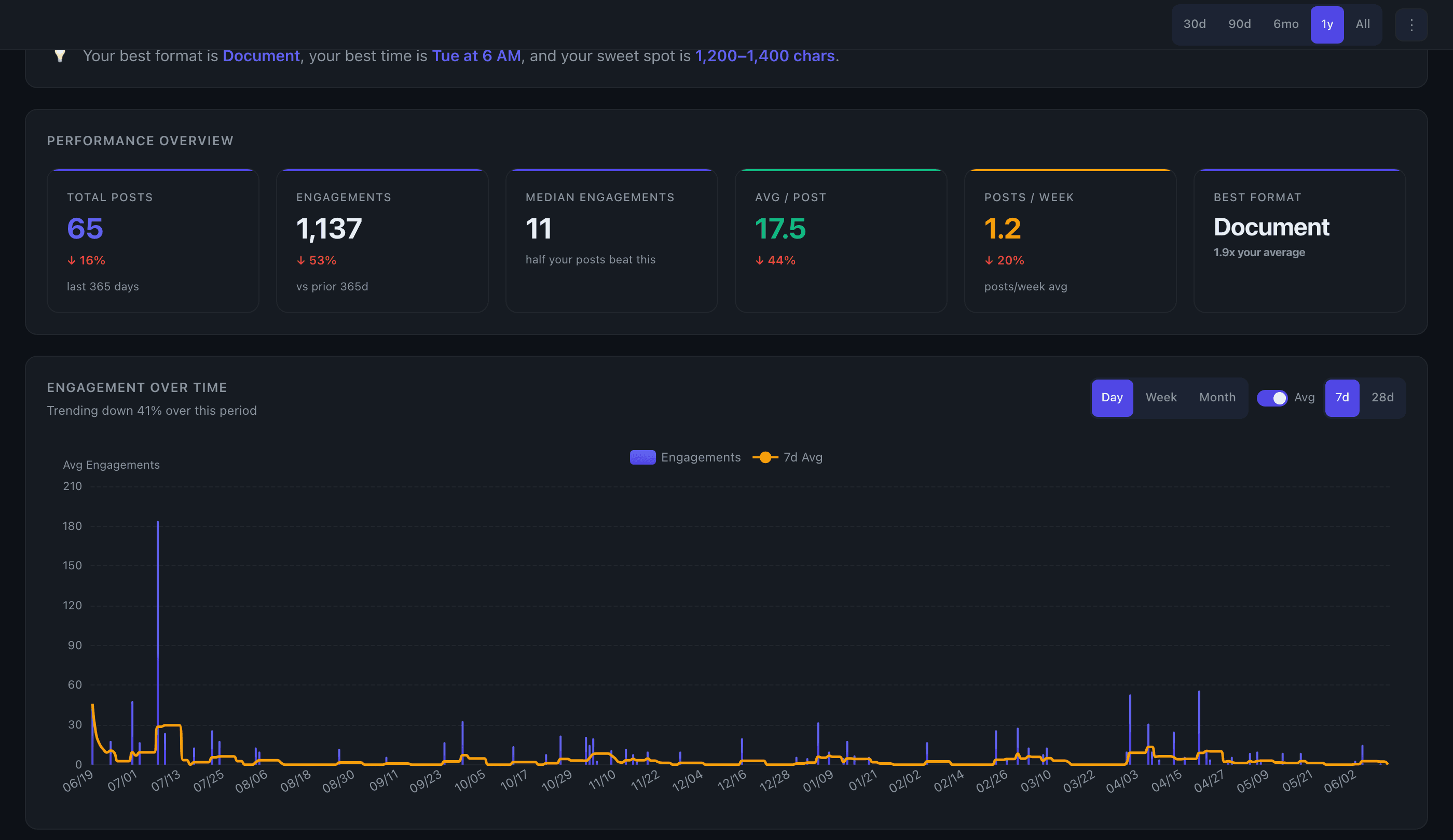
When your data finishes loading, the dashboard renders at /dashboard. At the top is a Performance Overview section with six KPI summary cards:
- Total Posts — how many original posts are in your dataset
- Total Engagement — combined likes, comments, and shares across all posts
- Avg Engagement / Post — your baseline engagement rate
- Posts per Week — your average posting cadence
- Engagement Trend — change in engagement vs. the prior 90-day period
- Best Format — the post type with the highest average engagement
Below the KPI cards the dashboard continues with a full set of charts: Engagement Over Time, Best Day of Week, Best Time of Day, Content Type Breakdown, Post Length vs Engagement, Day x Time Heatmap, Top Posts, Topic Performance, Posting Frequency, Top Link Domains, and Hashtag Analysis.
Controls
Date range — pills in the top-right header (30d / 90d / 6mo / 1y / All) filter every chart simultaneously. "All" covers your full post history, which typically goes back about a year from when you signed up.
More filters — the ⋮ button next to the date pills opens a secondary bar where you can change the metric (Engagements, Likes, Comments, Conv. Rate), switch between Avg and Total aggregation, and toggle Growth-adjusted mode if available.
Growth-adjusted — when enabled, removes the effect of audience growth from your metrics so results reflect content quality rather than follower count. This toggle only appears on Edge plans with enough posting history for the model to run.
Export — the Export button (top-right, authed users only) lets you download your posts as CSV or JSONL, or connect to a BI tool via the API.
Chart-level controls
Each chart section has its own local controls that don't affect the rest of the dashboard:
- Engagement Over Time — toggle granularity (Day / Week / Month) and a rolling average overlay (7d or 28d, day mode only)
- Best Day of Week — switch between engagement metric and post count views
- Content Type Breakdown — filter by whether posts contain a link
- Day x Time Heatmap — toggle between Actual (your real posts) and Projected (modelled slots you haven't used)
- Top Posts — rank by Engagements, Likes, Comments, or Shares; filter by post type; sort Top / Bottom / Recent; search by keyword
- Topic Performance — switch between Frequency and Distinctive modes, words vs. phrases, minimum post threshold, and result count
- Posting Frequency — Day / Week / Month granularity
Tips
- The Engagement Trend card on the KPI row is the most-screenshotted artifact in Flux — it compares the most recent 90 days against the 90 days before that.
- Clicking a cell in the Day x Time Heatmap pre-filters the Top Posts list to posts from that day/hour slot, so you can read the actual content that drove that result.
- Clicking a topic or keyword in Topic Performance scrolls the page to Top Posts and filters it to posts containing that term.
- If your data is still loading when you first arrive, you'll see a "still processing" message. Refresh after a couple of minutes.
See the full dashboard feature overview →